I Made Some Data Visualizations For My Girlfriend

I just finished my undergrad last month, and it’s really sinking in how special and fleeting the past five years have been. I’m privileged to have had so many unique opportunities and experiences throughout these fourteen trimesters, both in my career and personal life. I’ve also met so many amazing people that I’m lucky to call my friends. In fact, I happened to meet my soon-to-be best friend during the first week of university, and now we’ve been dating for over four years.
To commemorate spending all of my university life with Camille, I made some data visualizations of our Facebook messages. This involved analyzing over 152,000 messages that span from October 2013 up until April 2018. Let’s dive in!
Graphs
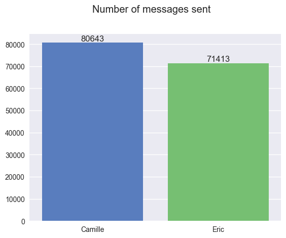
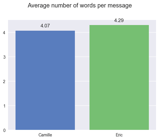
Camille messages more, but at least I have more words per message… Hope that makes up for the difference. 😅
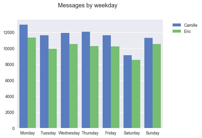
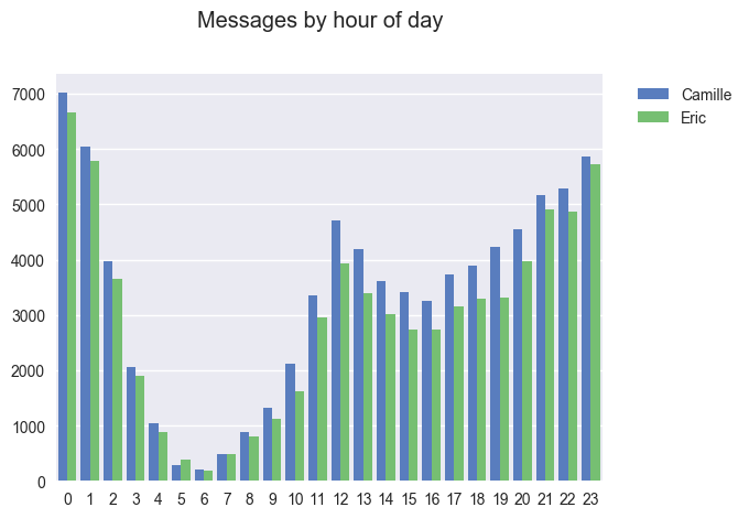
Camille messages more at every hour and every day of the week… except for 5AM. Probably because of my bad sleep habits, or the timezone difference from when I was traveling. I swear Camille has a weirder sleeping schedule, but the stats don’t lie.
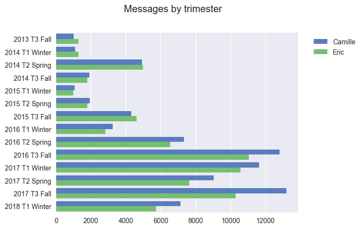
As anyone from UWaterloo knows, UW students’ lives are divided into four month chunks, where we alternate between school and co-op. This involves a lot of moving around, so our texting habits are bound to vary a lot every trimester.
The trimesters with the most messages all occurred when we were super long-distance. I was in California in Fall 2016 and Fall 2017, and I was in Singapore in Winter 2017. Probably the life story of too many UWaterloo couples lol.
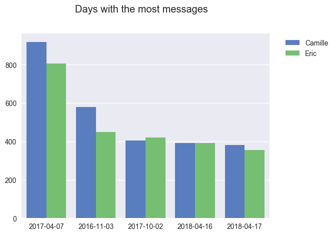
The top three were just average days while we were long-distance. On the top day, April 7th 2017, I started binging The Get Down on Netflix, and I was live-texting her my reactions. (why did they cancel it?? 😭)
The fourth and fifth days were very recent; it looks like we were procrastinating by talking to each other instead of studying for our exams.
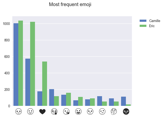
That’s a lot of sad faces. I guess we’re both stressed out and anxious a lot in university, so please don’t read too much into it LMAO.
Also, note how I’m clearly the more positive and affectionate person. Where my heart emojis at, Camille??
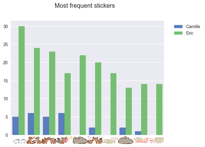
I’m constantly serenading Camille with romantic stickers, but she never reciprocates. Wish my gf’s sticker game was stronger.
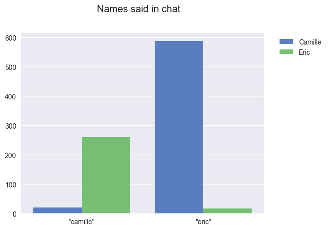
Why does Camille say my name so much? I know you’re talking to me, we’re the only two people here.
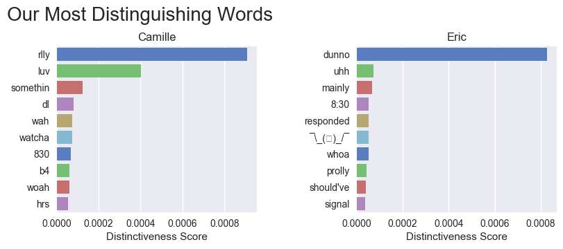
To quantify distinctiveness of our words, I computed the
TF-IDF values of every word. If a word has a higher score for a person, that means that word is more likely to be spoken by that person.
It’s fun to see how we talk differently. She likes to leave off the G in “-ing” words. I say “whoa” and she says “woah”. I say “8:30” and she says “830”. I didn’t realize we complained about early classes so often for it to be statistically relevant though.
I also made a similar graph for most distinguishing words per trimester. It was a blast looking through it with Camille, but it exposes us too hard to share here, haha.
These were all of the most interesting graphs I managed to make! Camille, thank you for all the experiences we’ve shared during university, and the many more to come. ❤️
How To Make Your Own Graphs
If you want to see these graphs for your own Facebook messages, you’re in luck. Try out ChatStats on Github to make your own data visualizations. ChatStats even works with group chats, which are also incredibly fun to analyze.
For those with coding experience: the code is easy to modify and extend, so you can quickly put together new types of graphs.
If you do try out ChatStats, let me know in the comments!
This post’s cover photo was taken at a random stop on a highway in Iceland. Photo taken by Kitty Huang.